
TBH Design System: Keeping it honest with Vox
TBH is more than just a design system—it's a creative powerhouse tailored specifically for Vox. Unlike conventional systems, TBH infuses Vox's unique brand essence, ensuring a consistent and authentic user experience across all platforms.
Duration
Feb 24' - April 24'
Role
Visual Designer
How we gave Vox it’s first design system
Vox.com is an American news and opinion website known for its explanatory journalism. However, despite its popularity among younger demographics aged 25 to 35, a lack of a formalized design system has hindered user experience. This wasn’t a real-world client project, but rather a class passion project where my team and I set out to reimagine Vox’s digital experience as part of our coursework. In response, we developed TBH (To Be Honest), a comprehensive design system crafted from the ground up to improve accessibility and user engagement.
My Role
I worked alongside a small team to audit Vox’s existing design, define principles, build scalable components, and document it. This was my first end-to-end experience creating a design system, and it was an opportunity to push myself, learn, and collaborate in ways I hadn’t before.
DURATION
Feb 24’ - May 24’
(4 Months)
TOOLS
Figma
Zeroheight
PROJECT TYPE
Coursework
TEAM
Priyanka (me)
Sanjana
Sagar
Prof. Craig McDonald (Mentor)

NAMING WITH HONESTY
Why "TBH”?
While documenting we were ideating on the possible names for naming our design system.
We landed on "TBH: To Be Honest"— inspired by a widely-recognized internet slang term that denotes a candid, vulnerable mode of communication. Embracing this informal yet sincere tone aligns with Vox's brand voice.
THE PROBLEM
No formal design system/style guide existed for vox.com
Why?
When designing for various brands in the past, many of the pains I encountered were knowing how to address the inconsistencies between my designs and live applications/websites. And believe it or not, it was largely either because—
-
The developers were working with different assets, or
-
When you work in a team, your design thinking, style, and approach are disruptively different from the approach of your colleagues, leading to a lot of back and forth between designers and developers.
-
While the design team would have started off with a basic style guide, as the product scaled, they never found the time to properly document and maintain or expand it.
While I can’t speak for VOX, I suspect they faced similar challenges.
The lack of a design system manifested in several ways in Vox's online presence.
Our audit revealed glaring inconsistencies across the website—
-
varying components,
-
accessibility issues, and
-
conflicting styles


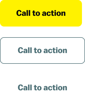
There are at least 8 variations of CTA buttons
present across pages on Vox’s website.


Endless variation of Links some bold, some underlined


Multiple variation of similar icons

We dissected the existing UI and audited it thoroughly to better understand the existing ecosystem of vox.com by taking screenshots of all the main design assets.
PROCESS
How did we approach the problem?
While we weren’t directly working with Vox, we aimed to tackle their challenges as if we were their in-house team.
Audit and Analysis
Setting Design principles
Constructing the UI kit
Conducting usability tests
Documenting the system
DESIGN PRINCIPLES
Building Vox’s Design DNA
Drawing on my past experiences and the common pitfalls designers face, I knew we had to establish a solid foundation before starting - a set of design principles, if you will, to serve as guiding lights as we moved forward. These would be a few loose yet impactful guidelines to anchor our decisions down the line.
Therefore, aligning with VOX’s own values, we established the following principles for VOX’s design system
BE BOLD
-
Unapologetically distinct
-
Fearlessly creative
BE PURPOSEFUL
-
User-centric
-
Clarity through simplicity
-
Precision
BE INCLUSIVE
-
Embrace diversity
-
Empowerment through accessibility
ATOMS, MOLECULES, ORGANISMS & TEMPLATES
Constructing the system
While I did have experience adhering to a design system/style guide before, I had never previously created one myself from scratch.
This meant learning from the popular publicly available design systems like that of HIG, Material design, Carbon, AXA, etc.
Furthermore, Incorporating Atomic Design principles really helped me step up my game.
A sneak peek on how I organized my components using Brad Frost’s atomic design principles
Atoms

Molecules

Organisms

Templates

CREATING A SYSTEM THAT’S BUILT FOR COLLABORATION
How can I make this easy for both designers and developers?
Looking back at the original problem at hand –I knew I had to create a design system that would be easy for both designers and developers to use and understand. After all, the needs of the developers were just as crucial as the designers'.
For Designers
The design system is likely to be used by multiple designers and could also potentially expand, we decided on using nested components and using component properties to simplify variants.
It’s still an ongoing learning experience to identify which components will be needed for reuse and which elements are specific for edge cases.

Three basic buttons with six variations gave us a combination of 135 buttons

Stroke width for some icons was reduced from 2px to 1px when switching to a smaller size to maintain legibility on smaller viewports.

Typography styles included sizing flexibility for smaller devices.
and many more...
These elements had multiple variants for type, size, and states built in.

We settled on a straightforward 3-tier color token system that provided the necessary flexibility.
For Developers
While we couldn't incorporate every possible need of a developer due to time constraints, we did define some basic guides, such as-Token systems and Variables


Variables for different elements and viewports were defined

We discussed color tokens for a whole working session.

We pitched our design system to a group of hypothetical Vox stakeholders (played by our classmates and professor) as part of the coursework.
Check out out pitch deck
REFLECTIONS AND TAKEAWAYS
How this project shaped me
01
Given that this was my first experience creating a fully-fledged design system, I significantly upskilled myself during this project. I learned about creating components, utilizing auto layout, understanding the purpose of variables, and implementing variants.
02
We realized that simply creating a UI library in Figma is not enough; documenting it is key. Defining usage and accessibility guidelines and providing suitable resources for all relevant stakeholders of the design system is essential to avoid the need for subsequent redesigns, thereby streamlining their workflow. Why leave things to the imagination?
03
As designers, we were somewhat biased in thinking that the design system was solely for designers; however, we were mistaken. Ensuring that guidelines cater not only to designers but also to developers and product managers is essential.

Meet the TBH team: Priyanka (me), Sanjana and Sagar
Our team of three came from different disciplines, and while that sometimes meant debates over the smallest details, it also meant every decision was stronger because of our diverse perspectives.
Our team oversaw the maintenance of the design system until May 2024, after which we discontinued our involvement with the project. However, during our tenure, we gained substantial expertise in developing a design system that emphasizes web accessibility and adheres to a cohesive design language.
POTENTIAL IMPACT ON VOX
Why should Vox adopt TBH design system?
Implementing the TBH design system could drive measurable improvements across key business and user experience metrics for Vox, including:


Note: While we didn’t directly implement this for Vox, these projections are based on industry benchmarks and observed trends and results from similar implementations by other brands.
DOCUMENTING THE SYSTEM
The Playbook for TBH
To simplify things, we created a detailed set of guidelines that outlined
-
Clear Dos and Don’ts: Guidelines to balance flexibility with consistency.
-
Accessibility Standards: WCAG-compliant designs to ensure inclusivity.
-
Developer-Friendly Resources: Tokens, variables, and clear naming conventions for seamless implementation.
Thus giving users the perfect balance of flexibility and direction in their decision-making.
For documenting it all, we relied on Zeroheight—a centralized hub that housed every resource and detail about the design system.
DESIGNING FOR EVERYONE
Making Accessibility a Priority
We prioritized accessibility in our design system and followed the WCAG guidelines to ensure that our design system is inclusive for users with disabilities.


TBH Design system published in Figma community for public use.
30
Users are already using the TBH design system
USABILITY TESTING
Did it work?
We tested the TBH UI kit with 3 participants tasked with recreating the Vox homepage in under 30 minutes.
Here’s what we found:
-
Some components were difficult to locate due to naming conventions.
-
Participants used varied terminology, leading to confusion.
-
A few components were missing key variants.
We iterated based on this feedback, refining the UI kit before publishing it on the Figma Community.

User testing in progress.
DESIGN PRINCIPLES
Building Vox’s Design DNA
Drawing on my past experiences and the common pitfalls designers face, I knew we had to establish a solid foundation before starting - a set of design principles, if you will, to serve as guiding lights as we moved forward. These would be a few loose yet impactful guidelines to anchor our decisions down the line.
Therefore, aligning with VOX’s own values, we established the following principles for VOX’s design system
CREATING A SYSTEM THAT’S BUILT FOR COLLABORATION
How can I make this easy for both designers and developers?
Looking back at the original problem at hand –I knew I had to create a design system that would be easy for both designers and developers to use and understand. After all, the needs of the developers were just as crucial as the designers'.
For Designers
The design system is likely to be used by multiple designers and could also potentially expand, we decided on using nested components and using component properties to simplify variants.
It’s still an ongoing learning experience to identify which components will be needed for reuse and which elements are specific for edge cases.

Three basic buttons with six variations gave us a combination of 135 buttons

Stroke width for some icons was reduced from 2px to 1px when switching to a smaller size to maintain legibility on smaller viewports.

Typography styles included sizing flexibility for smaller devices.
and many more...
These elements had multiple variants for type, size, and states built in.
For Developers
While we couldn't incorporate every possible need of a developer due to time constraints, we did define some basic guides, such as-Token systems and Variables

We settled on a straightforward 3-tier color token system that provided the necessary flexibility.


Variables for different elements and viewports were defined

We discussed color tokens for a whole work session.
ATOMS, MOLECULES, ORGANISMS & TEMPLATES
Constructing the system
While I did have experience adhering to a design system/style guide before, I had never previously created one myself from scratch.
This meant learning from the popular publicly available design systems like that of HIG, Material design, Carbon, AXA, etc.
Furthermore, Incorporating Atomic Design principles really helped me step up my game.
A sneak peek on how I organized my components using Brad Frost’s atomic design principles


BE BOLD
Unapologetically distinct
Fearlessly creative
BE PURPOSEFUL
User-centric
Clarity through simplicity
Precision
BE INCLUSIVE
Embrace diversity
Empowerment through
accessibility
PROCESS
How did we approach the problem?
While we weren’t directly working with Vox, we aimed to tackle their challenges as if we were their in-house team.
Audit and Analysis
Setting Design principles
Constructing the UI kit
Conducting usability tests
Documenting the system

We dissected the existing UI and audited it thoroughly to better understand the existing ecosystem of vox.com by taking screenshots of all the main design assets.
NAMING WITH HONESTY
Why "TBH”?
While documenting we were ideating on the possible names for naming our design system.
We landed on "TBH: To Be Honest"— inspired by a widely-recognized internet slang term that denotes a candid, vulnerable mode of communication. Embracing this informal yet sincere tone aligns with Vox's brand voice.
THE PROBLEM
No formal design system/style guide existed for vox.com
Why?
When designing for various brands in the past, many of the pains I encountered were knowing how to address the inconsistencies between my designs and live applications/websites. And believe it or not, it was largely either because—
-
The developers were working with different assets, or
-
When you work in a team, your design thinking, style, and approach are disruptively different from the approach of your colleagues, leading to a lot of back and forth between designers and developers.
-
While the design team would have started off with a basic style guide, as the product scaled, they never found the time to document, maintain, or expand it properly.
While I can’t speak for VOX, I suspect they faced similar challenges.
The lack of a design system manifested in several ways in Vox's online presence.
Our audit revealed glaring inconsistencies across the website—
-
varying components,
-
accessibility issues, and
-
conflicting styles

There are at least 8 variations of CTA buttons
present across pages on Vox’s website.

Endless variation of Links some bold, some underlined

Multiple variation of similar icons
How we gave Vox it’s first design system
Vox.com is an American news and opinion website known for its explanatory journalism. However, despite its popularity among younger demographics aged 25 to 35, a lack of a formalized design system has hindered user experience. This wasn’t a real-world client project, but rather a class passion project where my team and I set out to reimagine Vox’s digital experience as part of our coursework. In response, we developed TBH (To Be Honest), a comprehensive design system crafted from the ground up to improve accessibility and user engagement.
My Role
I worked alongside a small team to audit Vox’s existing design, define principles, build scalable components, and document it. This was my first end-to-end experience creating a design system, and it was an opportunity to push myself, learn, and collaborate in ways I hadn’t before.
DURATION
Feb 24’ - May 24’
(4 Months)
TOOLS
Figma
Zeroheight
PROJECT TYPE
Coursework
TEAM
Priyanka (me)
Sanjana
Sagar
Prof. Craig McDonald (Mentor)
DEMO WALKTHROUGH
TBH in Action

A behind-the-scenes look at how TBH transforms design process into something cohesive, accessible, and scalable.
USABILITY TESTING
Did it work?
We tested the TBH UI kit with 3 participants tasked with recreating the Vox homepage in under 30 minutes.
Here’s what we found:
-
Some components were difficult to locate due to naming conventions.
-
Participants used varied terminology, leading to confusion.
-
A few components were missing key variants.
We iterated based on this feedback, refining the UI kit before publishing it on the Figma Community.

User testing in progress.

TBH Design system published in Figma community for public use.
30
Users are already using the TBH design system
DOCUMENTING THE SYSTEM
The Playbook for TBH
To simplify things, we created a detailed set of guidelines that outlined
-
Clear Dos and Don’ts: Guidelines to balance flexibility with consistency.
-
Accessibility Standards: WCAG-compliant designs to ensure inclusivity.
-
Developer-Friendly Resources: Tokens, variables, and clear naming conventions for seamless implementation.
Thus giving users the perfect balance of flexibility and direction in their decision-making.
For documenting it all, we relied on Zeroheight—a centralized hub that housed every resource and detail about the design system.

Building blocks
Quick start guide
Landing page of the documentation website
Element landing page providing an overview, styles and usage

Usage guidelines for components


A way for them to connect with the creators and offer feedback and suggestions or perhaps even contribute to the system
DESIGNING FOR EVERYONE
Making Accessibility a Priority
We prioritized accessibility in our design system and followed the WCAG guidelines to ensure that our design system is inclusive for users with disabilities.
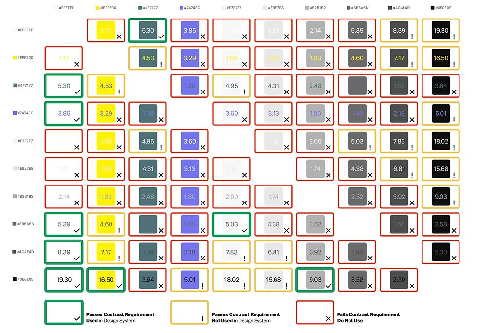
Accessibility color matrix

Guidelines to pass contrast check

Detailed accessibility guidelines documented
Note: While we didn’t directly implement this for Vox, these projections are based on industry benchmarks and observed trends and results from similar implementations by other brands.
15-20%
increase in user engagement
A consistent and accessible design could boost time-on-site and retention, especially among Vox’s target demographic.
30%
Faster time to market
Scalable components and clear guidelines reduce development time, allowing quicker rollouts of new features.
10-15%
Boost in User Retention
Cohesive designs build trust and encourage repeat visits, leading to higher satisfaction and stronger loyalty to the Vox brand.
POTENTIAL IMPACT ON VOX
Why should Vox adopt TBH design system?
Implementing the TBH design system could drive measurable improvements across key business and user experience metrics for Vox, including:

We pitched our design system to a group of hypothetical Vox stakeholders (played by our classmates and professor) as part of the coursework.
REFLECTIONS AND TAKEAWAYS
How this project shaped me
01
Given that this was my first experience creating a fully-fledged design system, I significantly upskilled myself during this project. I learned about creating components, utilizing auto layout, understanding the purpose of variables, and implementing variants.
02
We realized that simply creating a UI library in Figma is not enough; documenting it is key. Defining usage and accessibility guidelines and providing suitable resources for all relevant stakeholders of the design system is essential to avoid the need for subsequent redesigns, thereby streamlining their workflow. Why leave things to the imagination?
03
As designers, we were somewhat biased in thinking that the design system was solely for designers; however, we were mistaken. Ensuring that guidelines cater not only to designers but also to developers and product managers is essential.
Our team of three came from different disciplines, and while that sometimes meant debates over the smallest details, it also meant every decision was stronger because of our diverse perspectives.
